
Coupon Field Anxiety: The Hidden Conversion Killer on Indian D2C Sites
The Problem You Didn't Know You Had

Imagine this: a user is about to complete their purchase on your site. They've browsed the catalog, added items to cart, and are now on the checkout page. Everything seems on track. But then, their eyes land on an empty field labeled: "Enter Coupon Code".
In that moment, something shifts. They pause. They start thinking: "Am I overpaying? Should I have a code? Where do I get one?" Within seconds, they open another tab to search for discounts. Some return with a code. Many get distracted. Some never come back.
This is Coupon Field Anxiety—and it’s killing your conversions silently.
Why This Hurts More in India
While coupon fields are a global friction point, the impact is magnified in India due to:
Price Sensitivity: Indian consumers are deeply value-conscious. A missing discount feels like a missed opportunity.
Marketplace Conditioning: Users are trained by platforms like Amazon, Flipkart, and Myntra to always expect a deal.
Cultural Couponing: It's common to share codes on WhatsApp groups or search Google/YouTube for "XYZ coupon code".
A checkout page that shows a blank coupon field inadvertently introduces doubt—exactly when you want to inspire confidence.
The Psychology Behind It
Loss Aversion: People hate losing more than they like gaining. Not having a coupon feels like a loss.
FOMO: If there's a box, it must mean others are using it. Why am I not?
Distraction Loop: The moment they leave your site—even with good intent—the chances of return drop significantly.
This isn’t just about UX. It’s about human behavior.
A Real Example: What One Indian Brand Saw
Consider this example from a mid-sized Indian D2C fashion brand in the affordable clothing space:
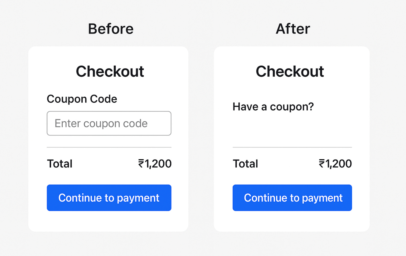
Control: A standard checkout page with a visible coupon field.
Variant: The coupon field was hidden, replaced by a discreet “Have a coupon?” link that expands when clicked.
Results after two weeks (10,000 visitors):
✅ +6.2% increase in checkout completions.
✅ -19% fewer drop-offs at checkout.
✅ No drop in valid coupon redemptions—users with codes still used them.
The secret? Reducing mental friction without altering functionality. Global eCommerce data backs this up—Shopify reports 5-10% conversion boosts from similar tweaks, showing this issue transcends borders.
Backed by Research: What Baymard Says
Baymard Institute, a leading UX research firm, recommends not displaying the coupon field prominently at checkout. Their studies found that:
"A prominently displayed coupon field causes 20-30% of users to abandon checkout to search for codes."
Their best practice? Tuck it away in a link that expands only when clicked. Exactly the same change Indian brands can benefit from.
Another Case Study: US vs Indian Market Response
A major US skincare brand tested removing the coupon field altogether and reported a 4.1% increase in conversions. When a similar test was replicated by an Indian electronics brand, the lift was even higher—nearly 7%, showing the amplified psychological impact in price-sensitive markets like India.
What You Can Do: Practical Fixes
1. Hide by Default
Replace the visible coupon field with a link that expands only when clicked. Language matters too—use "Have a coupon?" instead of "Apply code".
2. Auto-Apply Coupons
If you’re running a site-wide offer, auto-apply it. GoKwik and Flipkart have used this model successfully. Don’t make users work for the deal they’re already eligible for.
3. Offer Discovery Earlier
Show available deals before checkout: on PDPs, banners, or even in-cart. This avoids last-minute doubt.
4. Tiered Discounts Instead of Coupons
Make users feel rewarded just for hitting the cart milestone. Eg: "Spend ₹1,000 more to get 15% off."
5. Communicate Transparently
Add a note near the field: "No coupon needed—you're already getting the best price."
CRO Is About Reducing Friction, Not Just Testing Colors
It’s easy to think of CRO as a playground of button colors and layout tweaks. But some of the highest impact wins come from understanding psychology, user anxieties, and cultural behaviors.
The Indian eCommerce ecosystem is different—and it’s time our optimizations reflect that.
Final Thought
Sometimes, not showing something is the most helpful thing you can do. In the case of the coupon field, removing that tiny trigger could be the change that quietly lifts your revenue.
Think beyond design. Think behavior. That’s where true conversion growth lies.