
Designing E-commerce Landing Pages: UX Strategies That Convert
A detailed guide to creating landing pages that captivate users, build trust, and drive conversions.

At the heart of every successful online store lies its landing page—a vital touchpoint that turns visitors into customers. A meticulously crafted, intuitive, and engaging user experience (UX) can transform casual browsers into loyal customers. Whether you’re launching a fresh online venture or refining an established platform, mastering UX design for your landing page is the cornerstone of boosting satisfaction, engagement, and, ultimately, conversions.
This blog post dives deep into the art and science of designing e-commerce landing pages, drawing from expert insights and real-world examples to help you optimise every element of this critical entry point. From crafting captivating visuals to leveraging social proof and avoiding common pitfalls like overused carousels, we’ll explore actionable strategies with detailed examples to elevate your landing page performance.
Let’s embark on this journey to transform your e-commerce landing page into a conversion-driving powerhouse
Landing Pages: Your Shop Window to the World
Your landing page represents the very top of your funnel—think of it as your digital shop window. It’s your first and best chance to make a strong impression. This is where users decide if your site is worth their time, trust, and money.
New visitors arrive with low commitment and high skepticism. If they don’t immediately understand what you offer or why you’re different from familiar platforms like Amazon, they’ll bounce. You have just seconds to communicate three things: what you sell, how you're better, and why they should care.
A high-performing landing page must:
Communicate Value Quickly: Let users know what your brand stands for and what makes it unique—without making them scroll or guess.
Show Range and Relevance: Give a quick sense of the breadth of products or services you offer so they can tell if it’s worth browsing further.
Establish Trust: Use visual clarity, quality cues, and microcopy to signal that your brand is legitimate and reliable—especially if you're not a household name.
Guide the Next Step: Whether it’s browsing categories, signing up, or exploring products, make the next action obvious and frictionless.
In short, a great landing page answers the user’s unspoken questions: “What is this? Is it for me? Can I trust it?”
Measuring Landing Page Effectiveness
A successful landing page doesn’t just look good—it moves users deeper into the funnel. Its primary job is to generate interest in your products and get users browsing listings, not just casually reading content or bouncing away.
Bounce Rate: This is one of the clearest signals of how well your landing page is performing. If users land on your site and immediately leave without viewing another page, that’s a red flag. Aim for a low bounce rate by offering clear value upfront, a simple layout, and intuitive navigation.
Funnel Progression: It’s not just about keeping users on the page—it’s about what they do next. You want them to click into product listings, not drift off to unrelated content like blog posts that won’t contribute to conversion.
Attention Ratio: This metric compares the number of links on a page to the number of primary actions you want a user to take. Ideally, this should be as close to 1:1 as possible. That means one page, one goal. The more distractions—30+ links, multiple CTAs—the more cognitive load you add. Minimise these distractions and focus users’ attention where it matters.
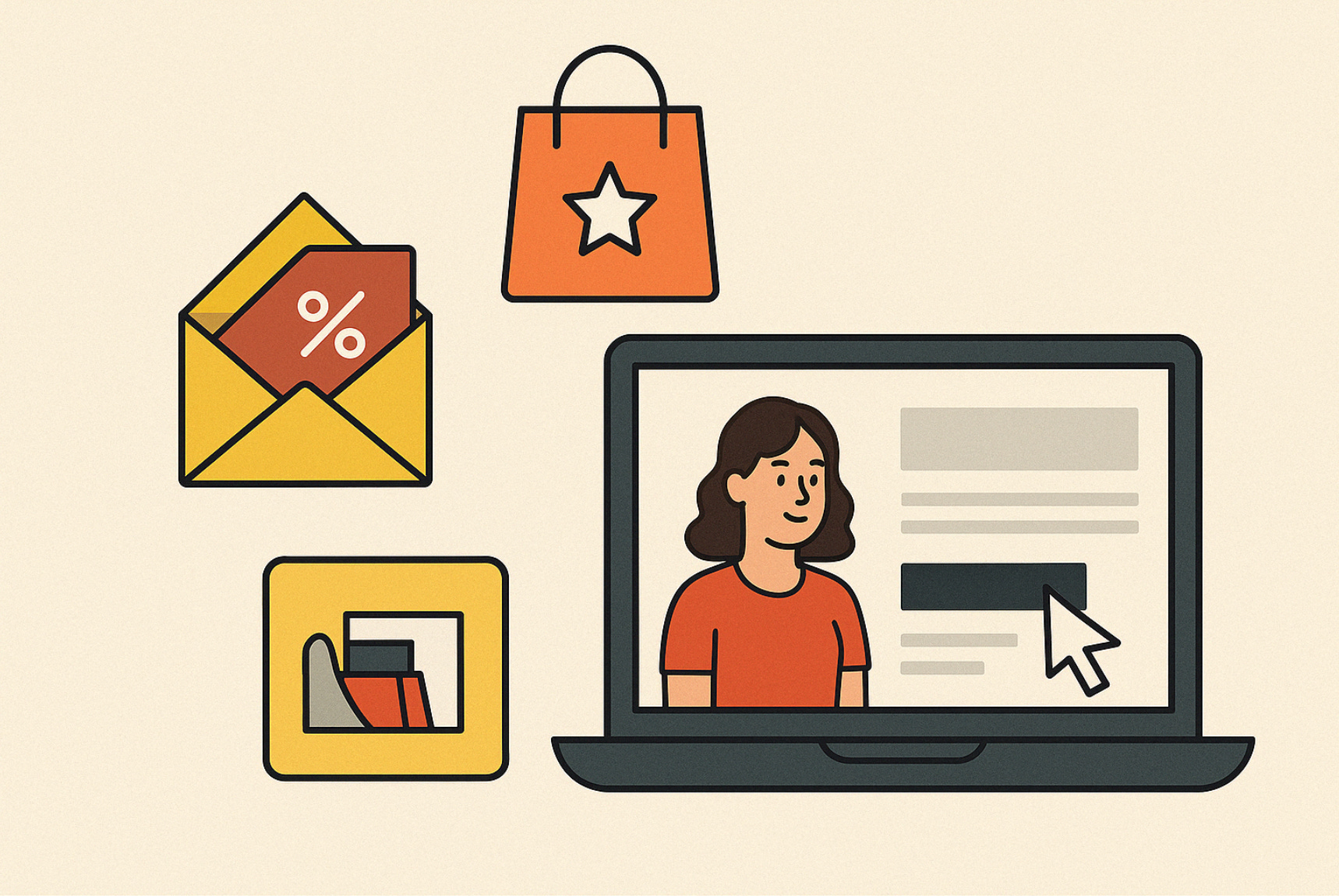
Main Image: The Visual Hook
Why Images Matter
What’s the first thing people notice about your website? It’s almost never the words—it’s the imagery. According to MIT research, our brains process visuals in just 13 milliseconds. That means your top banner image needs to work hard and fast.
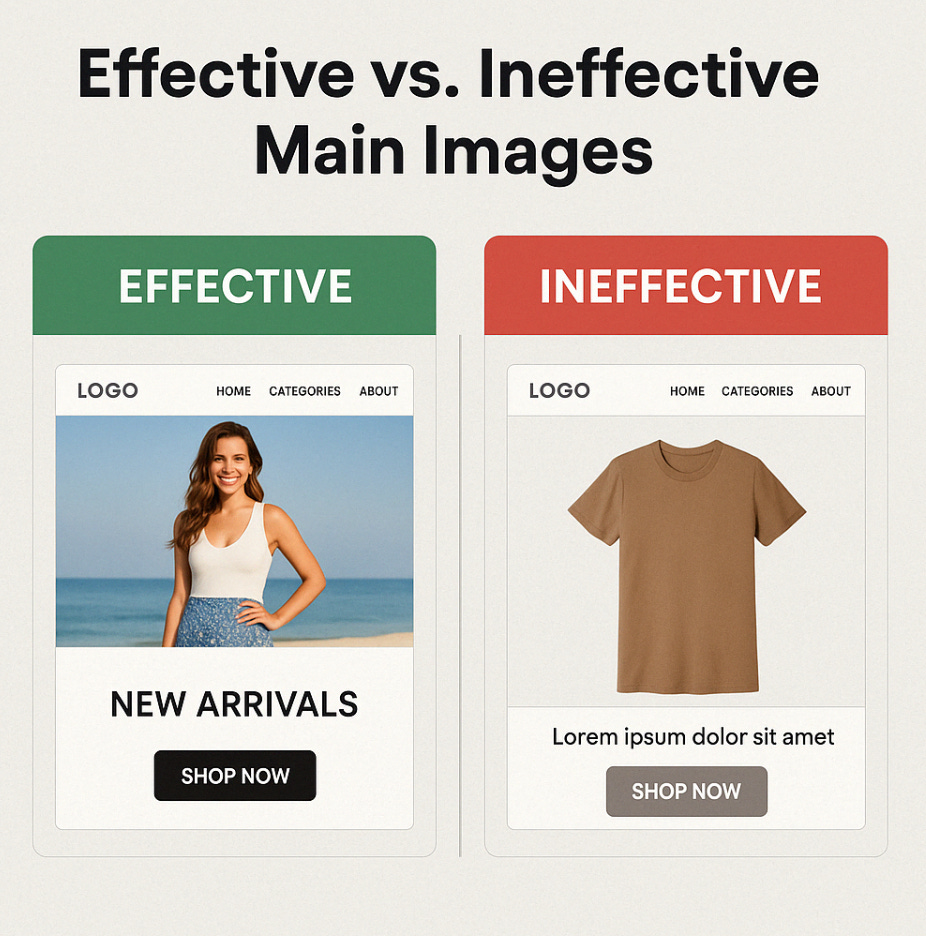
Choosing the Perfect Image
Single-Product Stores: Showcase your hero product with high-res, contextual shots (e.g., a watch on a wrist in a sleek setting).
Multi-Product Stores: Reflect your audience’s lifestyle. Selling outdoor gear? Show a hiker in action. Targeting luxury buyers? Feature elegance and exclusivity.
A fashion site aiming for an older demographic might feature a sophisticated woman at a chic cocktail lounge. Swap her out for someone in their early 20s at a beachside café and you’ll attract a totally different crowd.
Mirror your customers’ aspirations. For example, a fitness brand might use a vibrant gym scene to connect with active 20-somethings.
Generic or decorative images won’t cut it. Real-world imagery—showing products in context and aligned with user aspirations—builds trust and clarity
.
Main Heading: Your Unique Selling Point (USP)
The Role of Your Heading
Once your imagery has clarified what you sell, your main heading isn’t the place to list every product, shout about special offers, or promote new arrivals. Instead, it should highlight your Unique Selling Point (USP)—the one thing that sets you apart from giants like Amazon, eBay, or Booking.com. Without a clear USP, why would users stay? Your USP is your reason to choose you, and it must be distinctive—not generic perks like free shipping or returns, which competitors can easily match.
Keep it singular and concise, deliverable in a few words to grab attention instantly. Opt for niches (“The Specialists in Vintage Denim”), unique services (“Free Personalization on Every Item”), or production values (“Eco-Friendly, No Sweatshops”). Avoid clever jargon, invented terms, or hashtags that confuse users—clarity is key.
Crafting a Killer USP
A great USP is:
Clear and Concise: “Pure Indian Spices” on Everest Spices beats “We sell lots of spices,” while “Natural Beauty Products” on Mamaearth stands out.
Distinctive: Free shipping? Nice, but common. Try “Cash on Delivery Available” (Meesho), “Free Customization on Kurtas” (Manyavar), or “10-Minute Delivery” (Dunzo).
Jargon-Free: Skip clever hashtags or insider terms—users won’t decode them. Instead of “Heritage Chic,” FabIndia opts for “Authentic Indian Wear,” and Zomato uses “Food Delivered Fast.”
Examples to Inspire
Niche Focus: “India’s Best Ethnic Jewelry” (Tanishq)
Unique Perks: “Free EMI on Electronics” (Flipkart)
Ethical Edge: “Farm-Fresh, Organic Only” (Organic India)
A strong USP gives users a reason to choose you over giants like Amazon India or Flipkart—think of Patanjali’s “Natural and Ayurvedic” promise or Nykaa’s “Beauty for All.”
Social Proof: Building Trust from the Start
What is Social Proof?
Ever hesitated to try a new restaurant until you saw glowing reviews? That’s social proof—evidence that others trust your brand. For ecommerce, it’s a trust-building superpower, especially for new stores like Meesho or Craftsvilla.
Why It Works
Social proof—like reviews or awards—reassures users you’re legit. It’s like seeing a packed restaurant and knowing the food’s good.
Types to Leverage
Reviews: Display 5-star customer feedback (e.g., “Best headphones ever!”).
Awards: Show off industry badges or certifications.
Media Mentions: A Forbes quote adds instant cred.
Stats: “Trusted by 500,000+ Shoppers” screams reliability.
How to Use It
Place 2–3 high-impact examples on your landing page (e.g., a review snippet or a “Featured in Vogue” badge).
Save detailed proof for a dedicated “About” or “Reviews” page to avoid clutter.
Case Study: Warby Parker’s homepage uses customer testimonials and press logos to build trust, contributing to a 30% conversion rate increase (2022 data).
Promotions: Tempting Without Overwhelming
The Double-Edged Sword
Discounts can lure users in, but they’re tricky. Too many, and your brand looks cheap—unless “bargain basement” is your vibe (think Snapdeal or ShopClues). Overuse on sites like LocalBanya can dilute brand value.
Smart Promotion Strategies
Less is More: One or two well-placed offers beat a cluttered discount fest. A 15% off first purchase on Myntra, a 20% off festive deal on Flipkart, or a “Buy One, Get One Free” on Haldiram’s feels special.
Focus on User Needs: Guide them to what they want, not what you’re pushing. A rare “Diwali Electronics Sale” on Reliance Digital, a “Monsoon Grocery Offer” on BigBasket, or a “Holi Fashion Fest” on Ajio works better than constant deals.
Preserve Brand Value: Balance savings with prestige—don’t let discounts define you, as seen with Tanishq’s selective gold offers, FabIndia’s curated sales, or Manyavar’s festive promotions.
A thoughtful approach keeps promotions effective without tanking your reputation.
Videos: Multimedia That Works
The Video Opportunity
Landing page videos often go unwatched because users aren't ready to invest time early in their journey. To make video content effective, auto-play short clips with muted sound, clear controls, and subtitles. Reserve longer or more detailed videos for deeper stages like product pages, where users are more engaged.
Key Points
Don’t Rely on Click-to-Play: Most users ignore landing page videos that require them to press play—especially early in the journey when attention spans are short.
Use Smart Auto-Play: If you use video, keep it under a minute, auto-play it silently, and provide unmute and pause controls. Add subtitles if there's dialogue to increase engagement.
Save Detail for Later: Videos are more effective deeper in the journey—like on product pages—when users are already interested and seeking more information.
Carousels: A Relic to Rethink
Homepage carousels, once popular, are now largely ineffective in mobile-first ecommerce. Autoplaying slides frustrate users, especially on mobile, where pausing or navigating them is tricky. While manually-operated carousels are an option, most new visitors won’t engage with hidden content. Unlike streaming platforms, ecommerce shoppers are less patient—so prioritize clarity and visibility.
Key Points
Autoplay Fails on Mobile: Without hover functionality, users must awkwardly time their taps, leading to poor experiences.
Manual Carousels Rarely Work: New users are unlikely to explore hidden content that may not be relevant to them.
Different User Mindsets: Carousels suit platforms like Netflix where users are content-hunting—not ecommerce sites where clarity drives conversions.
Ditch carousels for clarity—your users will thank you.
Primary Actions: The Path to Conversion
Guiding the Way
Your primary action—like “Shop Now”—is the heartbeat of your landing page. The homepage’s main role is to guide users toward relevant products by showcasing top-level categories clearly—not by overwhelming them with every option. Thoughtfully placed navigation links, supported by relevant visuals, help users take the first step deeper into the site.
Key Points
Prioritize Relevance: Don’t link to everything—highlight categories users are most likely to explore.
Use Visual Cues: Reinforce top-level navigation (e.g., 'Shop Men', 'Shop Women') with imagery that represents each section.
Support Discovery: Help users transition smoothly from homepage to more specific content by curating the journey with intent.
Extra Content: Enhance, Don’t Overload
The Role of Add-Ons
Extra content like blogs or social feeds can enhance your ecommerce site—but not on the landing page. Overloading users with non-essential information creates distraction and friction. Instead, integrate such content purposefully and progressively to support, not overshadow, the shopping experience.
Key Points
Relevance First: Tie content directly to the user’s task—like shoppable Instagram or Pinterest posts.
Reveal Gradually: Introduce value-added content through linked pages, not upfront.
Stay Focused: Keep the homepage clean; move deeper content to secondary sections.Extra content should support, not steal, the spotlight.
Mailing List Sign-Ups: Timing is Everything
The Pop-Up Dilemma
Email pop-ups can hurt more than help if poorly timed or lacking value. Instead of overwhelming users early, offer meaningful incentives and trigger pop-ups when users are more engaged. What matters most isn’t the number of sign-ups—but how many actually convert.
Key Points
Offer Real Value: A compelling discount or freebie performs far better than vague “updates.”
Time It Right: Trigger pop-ups after users have spent time on-site—not immediately on landing.
Measure What Matters: Don’t just track sign-ups—track email opens, clicks, and conversions to assess quality.
Focus on quality over quantity to build a list that actually engages.
Conclusion: Crafting Your Landing Page Masterpiece
A high-performing landing page doesn’t happen by accident—it’s the result of thoughtful design, continuous testing, and user-centric refinement. Prioritize clarity, engagement, and actionable design to drive better outcomes.
Key Points
Every Detail Counts: From images to CTAs, each element should support user goals and conversions.
Iterate with Purpose: Continuously test and refine using insights from tools like A/B testing.
Stay User-Focused: Build with your audience in mind—what works for them will work for your business.